Introduction
to Editorial Design

Editorial design is the art of designing magazines, newspapers, books, and other publications. It involves selecting the typography, colours, images, and layout that will best convey the message of the publication. Editorial design is an essential component of the publishing industry and helps to make printed material visually appealing and easy to read.

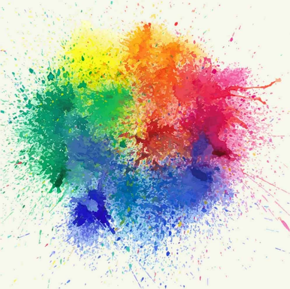
Colour in Editorial Design

Colour is an essential element in editorial design. It can create contrast, draw attention to important information, and create an emotional response in the reader. Choosing the right colour palette is essential to creating a successful editorial design.

Introduction to Editorial Design

Editorial design is the art of designing magazines, newspapers, books, and other publications. It involves selecting the typography, colours, images, and layout that will best convey the message of the publication. Editorial design is an essential component of the publishing industry and helps to make printed material visually appealing and easy to read.

Importance of Editorial Design

Editorial design is important because it plays a vital role in communicating the message of a publication. It helps to create a visual hierarchy that guides the reader through the content and makes it easier to understand. Effective editorial design can also make a publication more memorable and increase its impact.

Colour psychology is the study of how colours affect human behaviour and emotions. It is a fascinating field of study that has been the subject of much research over the years.

Colour theory

Colour theory is the study of how colours work together and how they can be used to create effective designs. Several key concepts in colour theory include monochromatic, analogous, and complementary colours.

Analogous colours are hues adjacent to each other on the colour wheel. They create a colour scheme that is visually pleasing and balanced, as they share similar undertones. Complementary colours are those that are directly opposite each other on the colour wheel. When used together, they create a vibrant, high-contrast effect that draws the viewer’s eye. Monochromatic colours are all derived from a single hue and are made by changing the saturation or brightness of that hue. This creates a cohesive, harmonious colour scheme that is easy on the eyes and creates a sense of unity. Other important colour concepts include triadic colours, which are three colours that are equally spaced around the colour wheel, and split-complementary colours, which are a complementary colour plus two colours that are adjacent to its complement.

“Design can be art. Design can be aesthetics. Design is so simple, that’s why it is so complicated.”

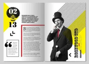
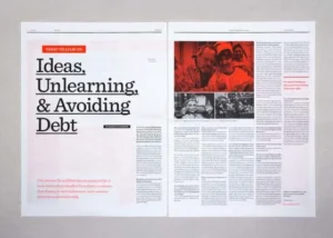
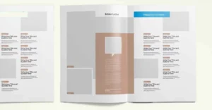
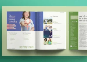
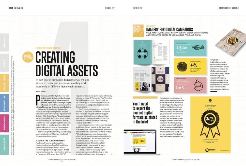
Immerse yourself in the world of our publication as you explore the dynamic layout, carefully crafted to guide you through the pages with ease. Our magazine spread is a celebration of the art of editorial design, created to inspire, inform, and delight our readers.

Images in Editorial Design

Images are used in editorial design to add visual interest and help tell a story. They can be photographs, illustrations, or graphics. The placement and size of images can have a significant impact on the overall design of the publication.

Layout in Editorial Design

Layout refers to the way that the content is arranged on the page. It includes the placement of text, images, and white space. A well-designed layout can make the publication easier to read and more visually appealing.

White Space
in Editorial Design

White space, also known as negative space, refers to the areas of the page that are left blank. It is an important element in editorial design because it can help to create a sense of balance and harmony on the page. White space can also be used to draw attention to important information and create a visual hierarchy.

Design Principles
in Editorial Design

There are several design principles that are important in editorial design. These include contrast, balance, proportion, hierarchy, and unity. Each principle contributes to the overall aesthetic of the publication and helps to create a cohesive design.

White space

White Space in Editorial Design

White space, also known as negative space, refers to the areas of the page that are left blank. It is an important element in editorial design because it can help to create a sense of balance and harmony on the page. White space can also be used to draw attention to important information and create a visual hierarchy

Typography features

Typographic features refer to the various characteristics of type that can be adjusted to achieve different visual effects in text. Here are some common typographic features:

  1. Typeface: This refers to the overall design of the characters, such as Helvetica or Times New Roman.
  2. Font Size: The size of the font determines how large or small the type appears on the page.
  3. Leading: Leading is the amount of space between lines of text and can affect the readability of the text.
  4. Kerning: Kerning is the adjustment of the space between individual characters in a word.
  5. Tracking: Tracking is the overall adjustment of the space between letters in a block of text.
  6. Weight: Weight refers to the thickness of the characters, which can range from light to bold.
  7. Style: Style refers to the overall appearance of the type, such as italic or bold.
  8. Alignment: Alignment refers to how the type is positioned on the page, such as left, right, center or justified.
  9. Hierarchy: Hierarchy refers to the visual organization of text elements, such as headings, subheadings and body copy.
  10. Contrast: Contrast refers to the visual difference between elements, such as the contrast between a bold heading and light body copy.
  11. Color: Color can be used to emphasize certain words or phrases in text.

By understanding and utilizing these typographic features, designers can create text that is not only legible, but also visually appealing and effective in communicating its intended message.